The first type of large landscape diagram that I'm going consider is a process landscape. This kind of diagram shows all processes within a given process area. Following the well-established approach of process leveling, these processes are generally arranged in some kind of hierarchy. The question that this diagram answers is:
“What are the top-level process areas, and how do they decompose into sub-processes?”
Now the first challenge that we face with a process landscape diagram is the sheer number of processes. The COBIT process map contains 37 processes and only covers the governance of IT. The APQC Process Classification Framework (PCF) lists 117 processes just for the Human Resources part of their catalogue. So the key question is how to show the hierarchy in a navigable manner.
We have one advantage here however. The process hierarchy is inevitably a tree-based hierarchy, i.e., each process has one and only one parent. This is in contrast to some of the more technical diagrams that we’ll consider in other posts, where a given server-application mapping could be many-to-many, or where several products each depend on the same set of applications.
Because the process hierarchy is purely tree-based, we can avoid the use of connectors, which involve a large number of lines, and instead show the hierarchy through nesting. That is, each parent process contains the child processes visually. Showing the hierarchy through nesting eliminates the need for a sprawling number of connector lines, providing a very clean and space-efficient way to demonstrate the structure of our process hierarchy.
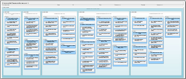
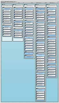
The next question is one of arranging the blocks. The simplest approach would be to arrange the top level processes horizontally, with any subsequent levels nested vertically, but in practice this leads to large amounts of unused space as seen in the first picture.
|
|
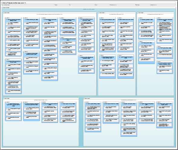
A better approach is to compromise, and when there’s more nesting in one area than in others, use a blend of vertical and horizontal arrangement.

When there’s a very large number of items to show, it may also be necessary to apply this to the organization of the top level:

The best rule of thumb is to try to get the collection of elements to fit into the dimensions of a printed sheet.
When laying out the diagram like this, any feature that allows you to move groups of items around together becomes invaluable – so it’s worth investigating what options your diagramming tool has for group selection and group moves.
At this point we’ve been able to arrange the processes in a fairly accessible, navigable format. However, we can improve on this by showing extra information on the diagram. If our diagramming tool allows it, adding icons to show one or two key pieces of information for each process is good idea, as it achieves both our goals in making this an impressive diagram for executives;
- It enlivens the diagram
- It calls out the amount of work and analysis underlying the diagram
In this post we’ve looked at some useful techniques to lay out a process landscape diagram. In subsequent posts we’ll start looking at some more architecture-focused landscape maps, starting with the Product Realization Diagram.

